

Visualisations
Visualisations
Section titled “Visualisations”There are 2 main areas of visualisations in KerusCloud:
• Virtual Population QC
• Decision Criteria Visualisations
Virtual Population QC
Section titled “Virtual Population QC”To generate quality control (QC) data for a project, go to the Project Dashboard and press the Generate QC button in the Virtual Population QC section. This generates estimates of distribution parameters, summary statistics and correlations based on the simulated virtual population data before any advanced options have been applied. Once the QC data has been created the Generate QC button will be replaced with a View button. Clicking View will open the QC visualisations.
The Quality Control results page contains two tabs, one for Variables QC and one for Correlations QC. The tables in these tabs contain QC data summarised across the simulations for a project.
If a variable is defined by one or more other variables it will have a row for each separate layer definition. The Requested column contains the variable parameters requested by the user. The Observed column contains estimates of the parameters calculated from the simulated data, summary statistics in the case of Survival and Derived variables or the correlation between variables for correlations.
Correlations between variables are only calculated when explicitly defined in the project. Drift is calculated as Observed - Requested values. Drift % is calculated as (Observed – Requested) / (|Requested| + ε) where ε = 0 if the requested value ≠ 0 and ε = 0.00001 if the requested value = 0 to avoid division by zero errors.
The filters above the table column names can be used to filter the table rows. Filtering by |Drift| and |Drift %| can help to highlight any rows that have disagreement between the requested and observed values. Negative Drift values are not accepted. Filters can be reset by clicking the clear filter button. All columns are mean averages across the simulations in a project.
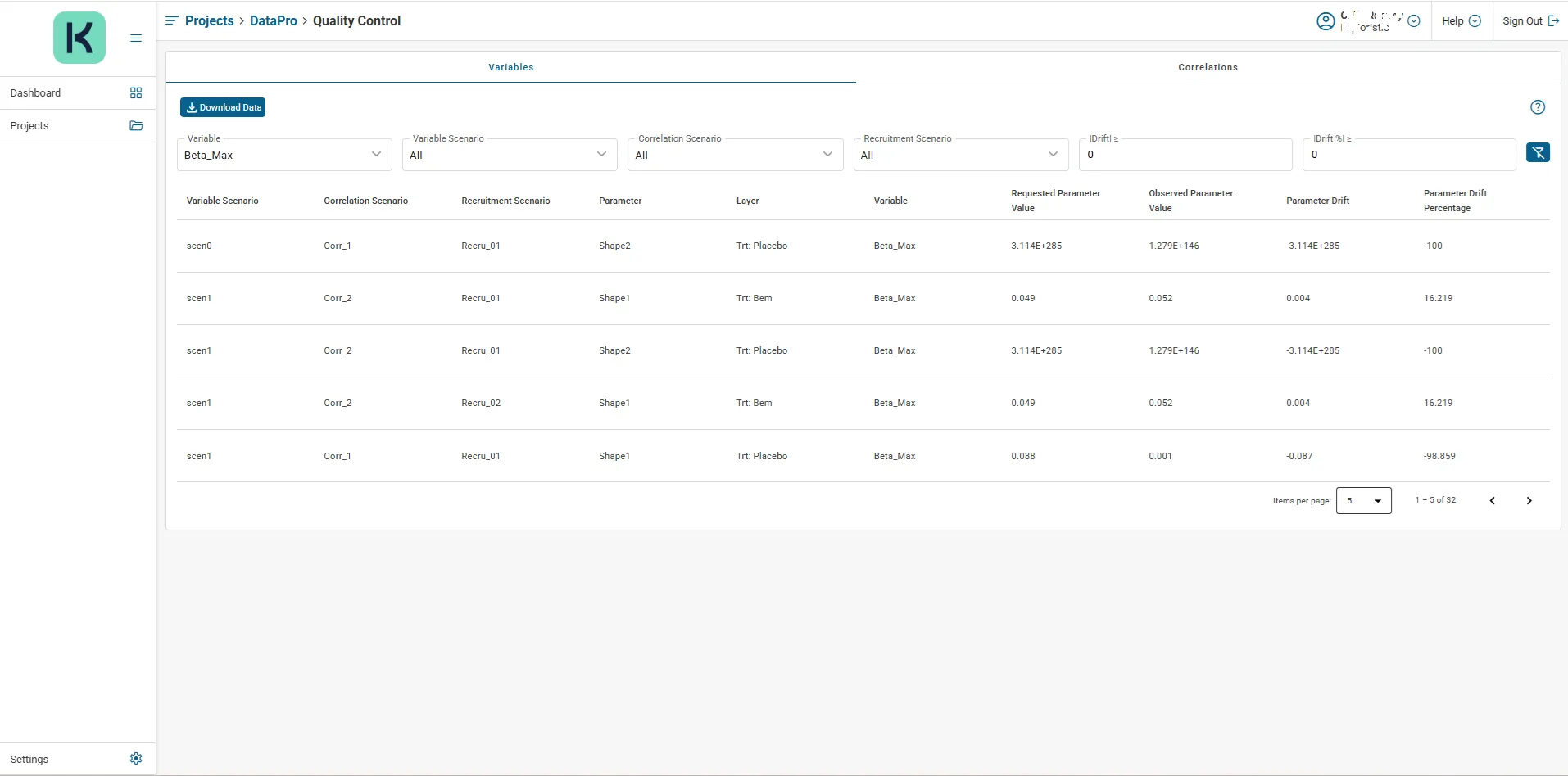 Figure 11: Sample QC Results
Clicking on a row of the table will show Simulation Level QC Results for the variable parameter or correlation corresponding to the clicked row. The popup displays plots of the observed QC data across simulations.
If the variable parameter or correlation has a single requested value this is shown as a histogram with a vertical line. For distribution-based parameters or correlations the requested values are plotted over the scatter plot with a kernel density estimate calculated from the requested values that were sampled from the user-specified distribution in each simulation. If the parameter or correlation is not defined by population then a histogram is plotted for each layer.
For all graph types, corresponding data can be downloaded via the Download Data button, an image of the graph can be downloaded via the Download icon. The popup is closed via the Close button.
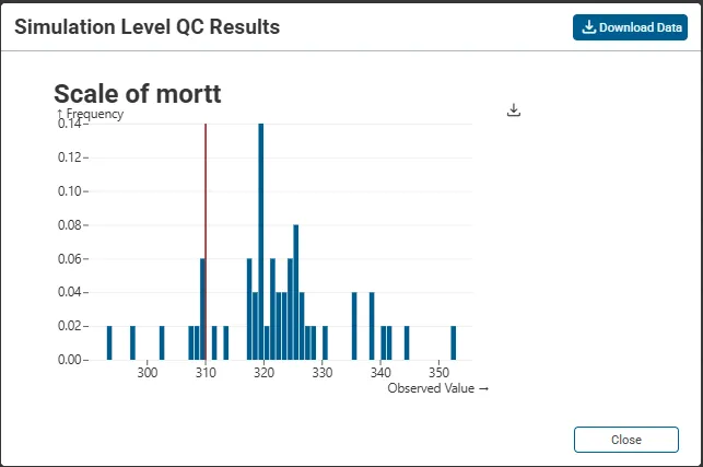
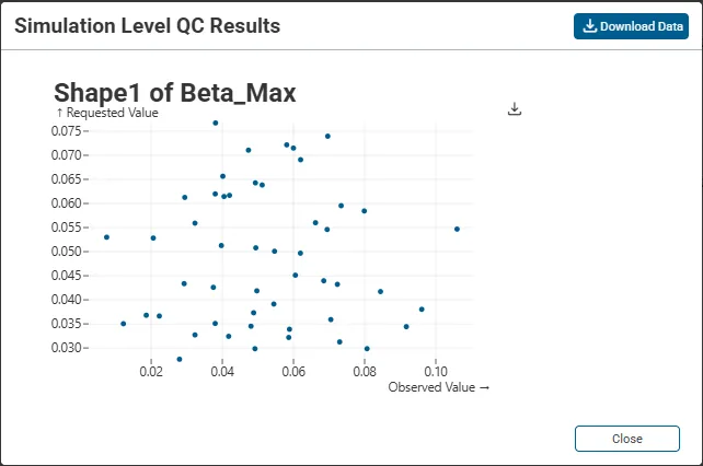
Figure 12: Sample Simulation Level QC Results
Decision Criteria Visualisations
Section titled “Decision Criteria Visualisations”The Decision Criteria Visualisations section of the KerusCloud project allows the user to create and visualise custom heatmaps based on the results of the study.
Creating a Heatmap
Section titled “Creating a Heatmap”At least one Sample Size, one Design and one Decision Criteria must exist before a heatmap can be created.
-
Click the View button in the Decision Criteria Visualisations section of the project dashboard
-
In the New Heatmap section enter a name in the Heatmap Identifier box and optional description in the Description box
-
Click to expand the Rows accordion, then click to select values from the rows available that you wish to visualise – at least one value from each of the available rows must be selected
-
Click to expand the Columns accordion, then click to select values from the columns available that you wish to visualise – at least one value from each of the available columns must be selected
-
Click Save in top right corner to save the heatmap definition
Heatmap Size: As you click to select additional values to rows and columns of the heatmap, the heatmap size will increase. A maximum size of 216 cells is allowed.
Deleting a Heatmap
Section titled “Deleting a Heatmap”Existing heatmaps can be deleted by clicking the Delete button next to the heatmap on the Heatmaps table.
Because heatmaps are dependent on elements (such as Decision Criteria, Sample Size, Allocation, Scenario, Recruitment Cap, Design) of your project that you have previously defined, deleting one of these elements will cascade through to and delete any associated heatmap automatically. You will be advised of any potential heatmap deletions in the deletion process.
Visualising a Heatmap
Section titled “Visualising a Heatmap”After successful completion of the Decision Criteria task, a heatmap can be visualised by clicking the associated Visualise button in the Heatmaps table.
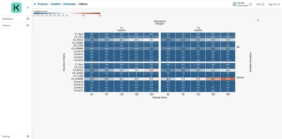 Sample Heatmap
A graphic file (.PNG) of the heatmap can be downloaded via the Download Heatmap Image icon.
Clicking an individual cell in the heatmap will drill-through to detailed Simulation Level results for that specific intersection between row and column, from here, the simulation level data may be downloaded (as JSON) for offline analysis via the Download Data button. You can switch between a grid or list display of the graphs on the tabs via the List view and Grid view buttons. Individual plots and tables may be downloaded by clicking the corresponding download icon.
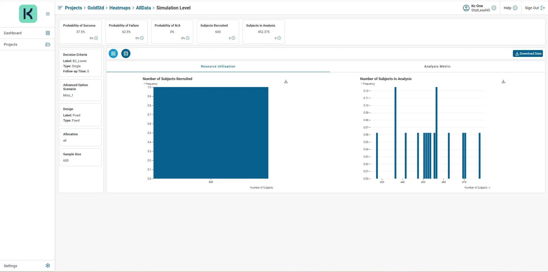 Sample Drill-through
The navigation breadcrumbs can be clicked to return you directly to your current heatmap, all current project heatmaps, your current project or all projects.
Customise Heatmap Settings
Section titled “Customise Heatmap Settings”Heatmap settings comprise Heatmap Preferences and Heatmap Filter Definition, these can be customized and applied to all heatmaps on a per project basis. Heatmap Settings can be accessed by clicking the Customise Settings link in the Heatmaps section.
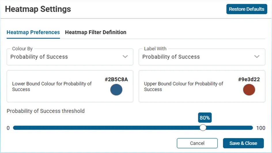 Heatmap Settings
From Heatmap Preferences, the visualisation of project heatmaps can be refreshed with selections from the Colour By and Label With drop downs and enabled with inspection of other operating characteristics in addition to Probability of Success - Probability of Failure, Probability of NA, Number in Cohort, Number in Analysis, etc. Probability of Success/Failure/NA threshold can be adjusted via the slider.
In Heatmap Filter Definition, you can control values displaying as rows or columns in the heatmap, with the proviso that at least one filter value is defined for rows and columns.
Heatmap settings apply to all heatmaps created in the project. KerusCloud default heatmap settings can be restored and applied to existing heatmaps at any time by clicking the Restore Defaults button followed by Save & Close in Heatmap Settings.